Module Samples
Content and Single Image Module
Suspendisse quis elit sit amet ex commodo lacinia. Cras venenatis mi lectus, eu tincidunt tortor suscipit nec. Phasellus ex quam, sodales quis metus ut, ultrices cursus magna. Quisque ac arcu at ipsum eleifend convallis nec ac tellus. Nam at metus mattis, auctor purus bibendum, vulputate diam.
Fusce enim nisi, feugiat quis efficitur ac, feugiat eu ex. Donec sodales volutpat dui, at congue erat lacinia vitae. Nunc in tellus quis lacus pharetra ornare. Curabitur vestibulum ipsum leo, condimentum aliquam ex venenatis et.
2 Column Option: Text and Video/Sizzle
This is the 40/60 size option. If we have the video in the banner/background, we may want to revise the on page video section to be more in line with this type of layout alongside the intro blurb/event description. This would keep things clean, reduce the scroll on desktop and allow us to potentially utilize more of these modules on the homepage without it becoming overwhelmingly long.
2 Column Option: Text and Video/Sizzle
This is the 50/50 size option, and on a background color (options: white, light blue, navy, gold, red). If we have the video in the banner/background, we may want to revise the on page video section to be more in line with this type of layout alongside the intro blurb/event description. This would keep things clean, reduce the scroll on desktop and allow us to potentially utilize more of these modules on the homepage without it becoming overwhelmingly long.
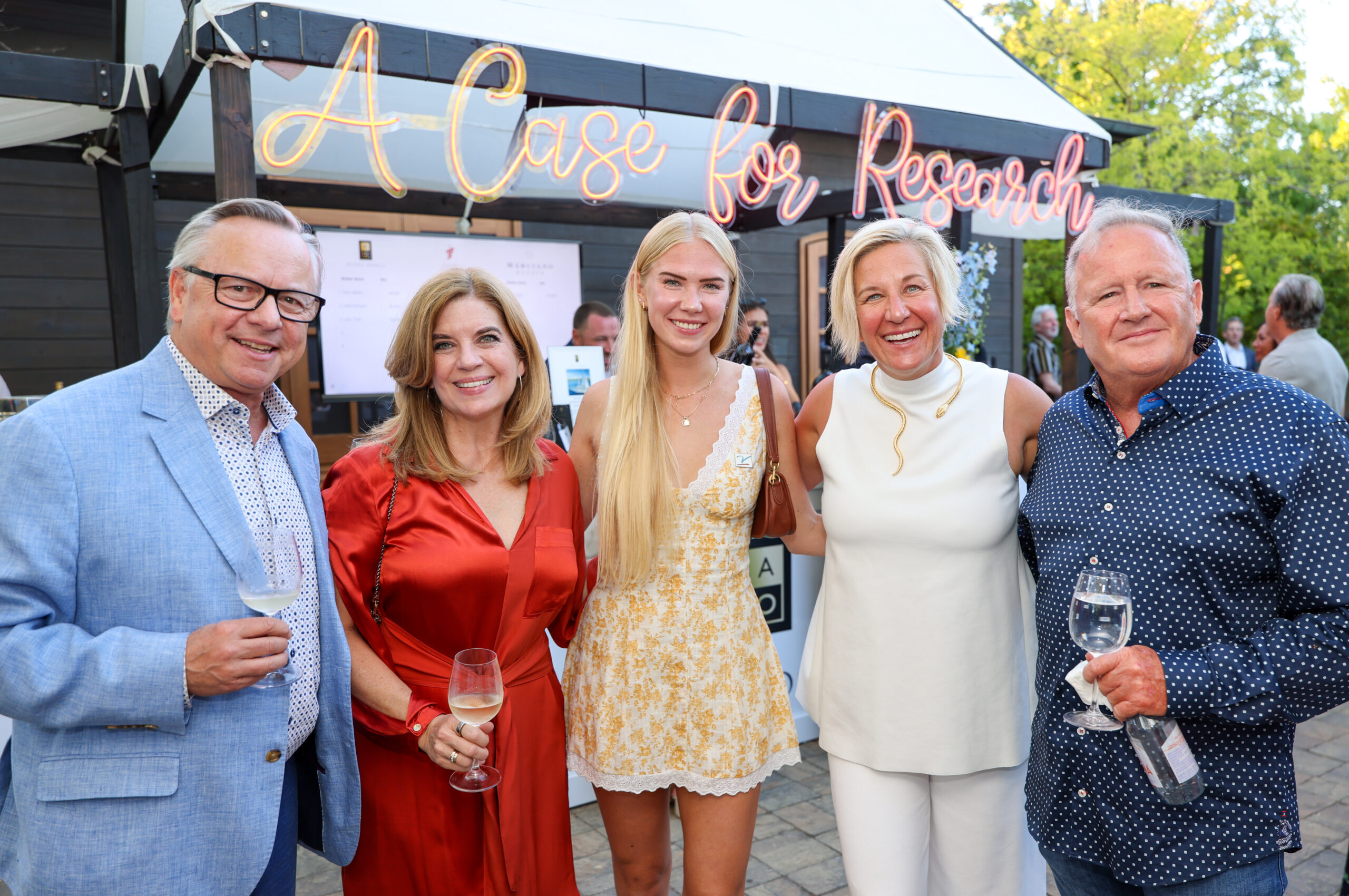
Image Carousel module
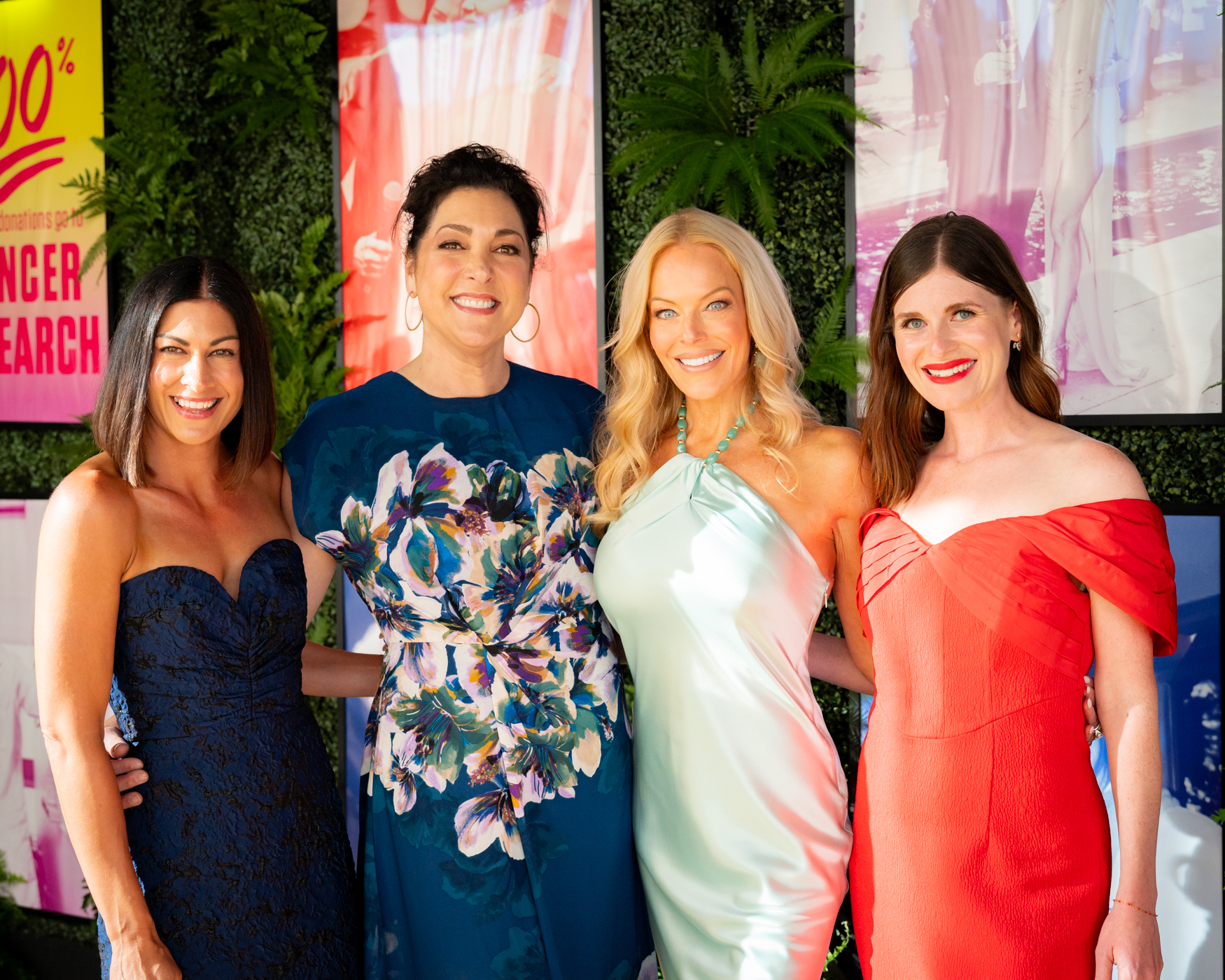
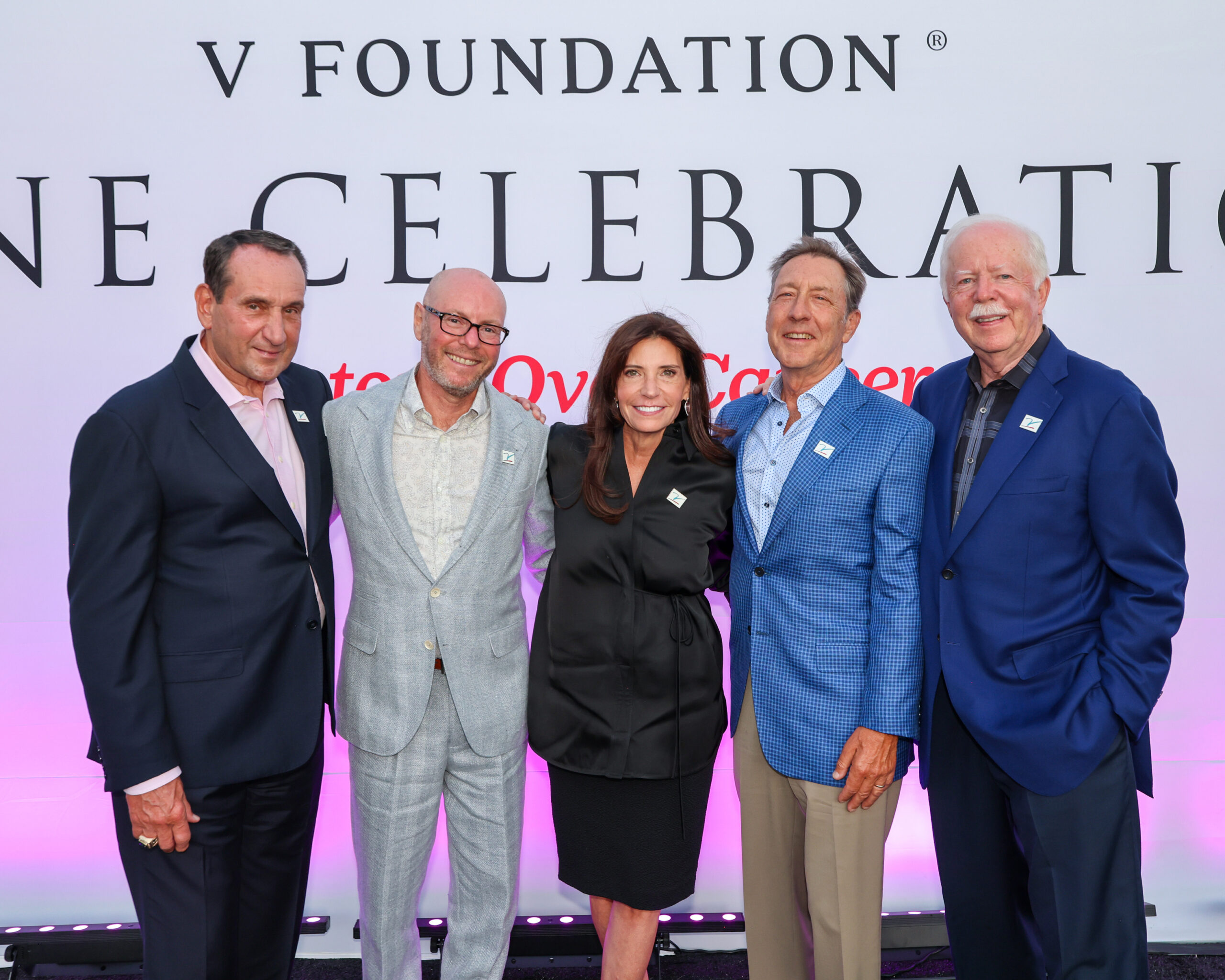
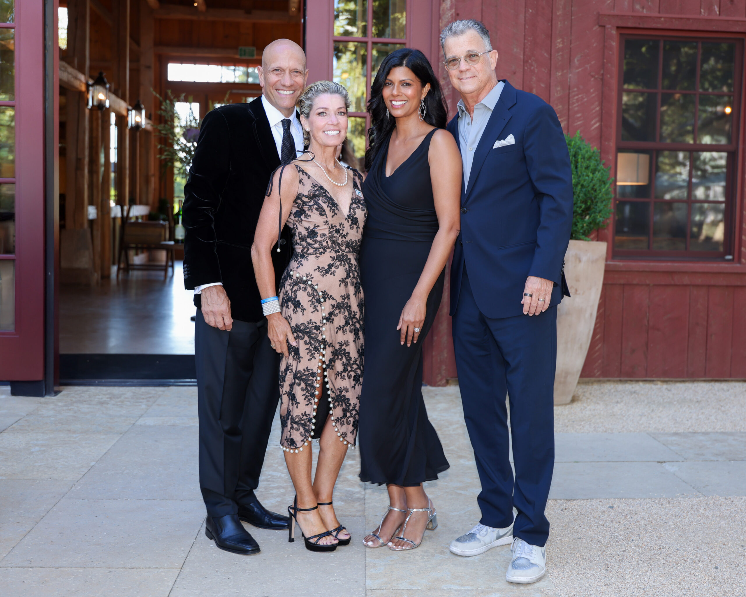
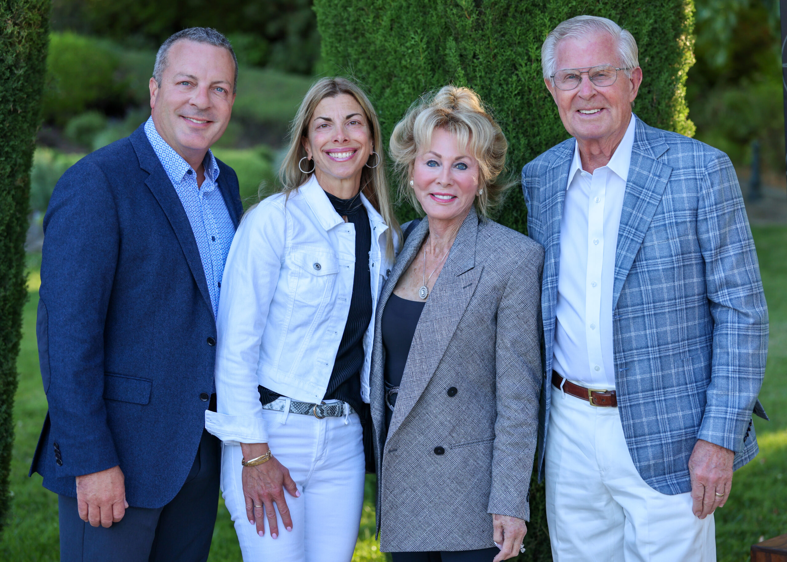
Image and Text Card Module
Can include a button, 2 or 3 per row
Lorem ipsum dolor sit amet
Suspendisse quis elit sit amet ex commodo lacinia. Cras venenatis mi lectus, eu tincidunt tortor suscipit nec. Phasellus ex quam, sodales quis metus ut, ultrices cursus magna. Quisque ac arcu at ipsum eleifend convallis nec ac tellus. Nam at metus mattis, auctor purus bibendum, vulputate diam.
Image Cards
2 per row, can link to anything (another page, registration, etc.), images would need to lean darker because we don’t have control over the text color for the title section
Testimonial Module
Can change the background image but it’s built to have a dark blue gradient on it as shown and the focus area far right so the words don’t get lost on a full/bright color
Accordion Block/FAQs
Can only be used with plain text, no images. Mostly used for FAQs or similar
 Mailing List
